
INSPIRED DESIGN. VISUAL RESULTS.
We’re passionate pros about artwork, visual expression, and embedding extra levels of design detail into everything we do. Like fonts. Legibility. Color philosophy. But the cool, creative stuff too. We draw. We paint. We illustrate. We design creative solutions that might surprise you a little but will make you say wow. Because that’s what it’s about: making sure the design amplifies you. We don’t have a “style” like some studios. Our style is to do your style, whatever it is. To make your brand resonate. To make it, because of the design it keeps, beautifully effective.
INSPIRED DESIGN.
VISUAL RESULTS.
We’re passionate pros about artwork, visual expression, and embedding extra levels of design detail into everything we do. Like fonts. Legibility. Color philosophy. But the cool, creative stuff too. We draw. We paint. We illustrate. We design creative solutions that might surprise you a little but will make you say wow. Because that’s what it’s about: making sure the design amplifies you. We don’t have a “style” like some studios. Our style is to do your style, whatever it is. To make your brand resonate. To make it, because of the design it keeps, beautifully effective.
Who’s On 1st
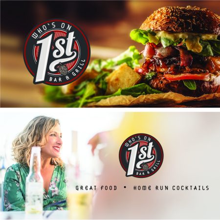
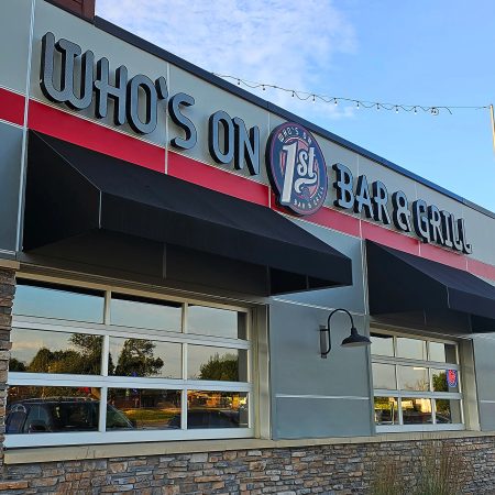
The Who’s On 1st brand captures the spirit of a classic sports bar, blending a vintage aesthetic with clean, modern design elements. Inspired by the iconic baseball comedy sketch and its First Street location, the brand exudes comfort, quality, and entertainment. The logo is an abstract/combination mark featuring dynamic calligraphy for “1st,” emphasizing its sports theme, while supportive typography ensures a relaxed, approachable vibe. A hop flower adds an organic touch, hinting at the quality drinks on offer, while the tilted design reflects the fun, energetic atmosphere. Every detail aligns to create a cohesive brand identity that invites guests to enjoy great food, drinks, and unforgettable experiences.
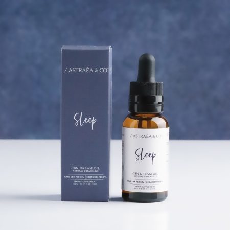
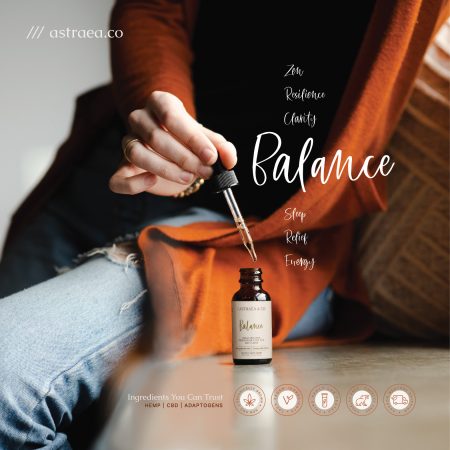
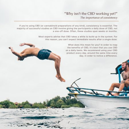
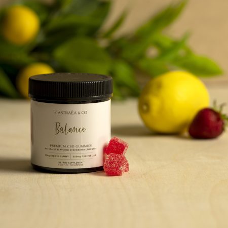
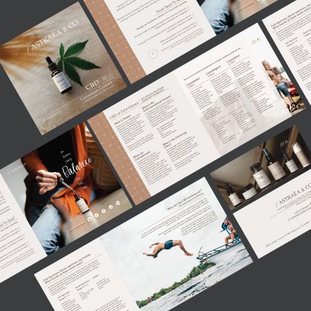
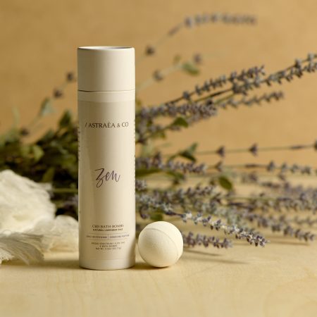
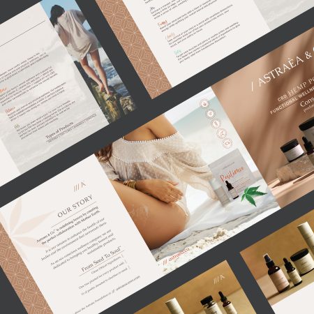
ASTRAEA & CO
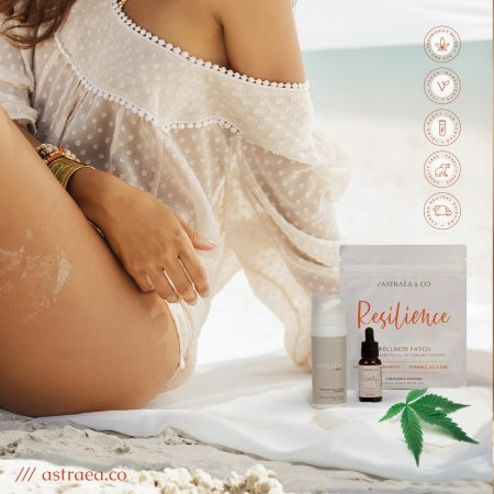
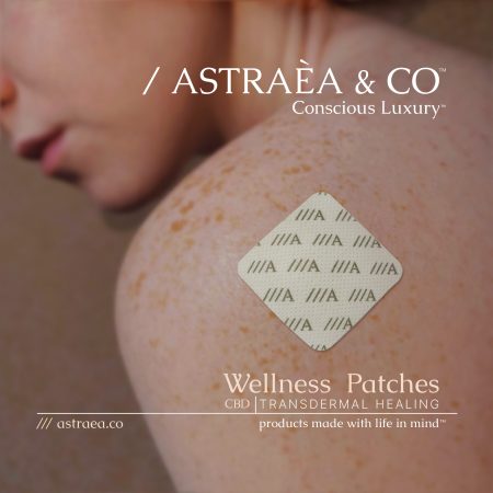
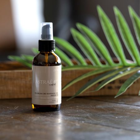
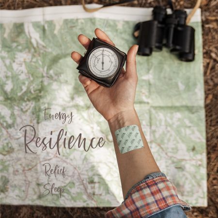
Astraéa & Co. sought to establish a high-end identity reflecting elegance and modern sophistication. The project involved crafting a comprehensive branding suite, including logo design, packaging, and marketing collateral. Focusing on clean typography, luxurious color palettes, and minimalist aesthetics, the designs exuded timeless refinement while appealing to a discerning, upscale audience. Deliverables included printed materials, digital assets, and product displays that harmoniously reinforced Astraéa & Co.’s premium brand presence.
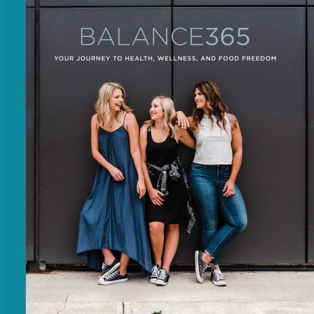
BALANCE365
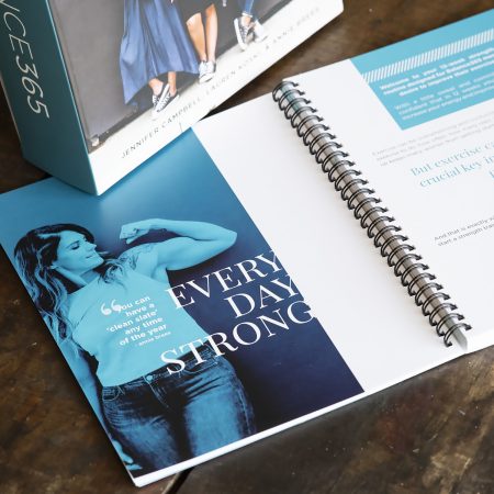
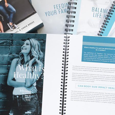
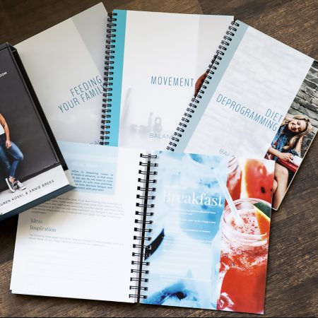
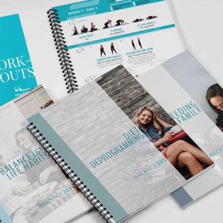
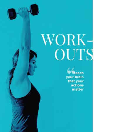
Balance365 is a collection of three books aimed at empowering women to achieve a healthier lifestyle. The project involved designing and laying out the interior pages for each book, ensuring clarity and readability while maintaining a cohesive visual identity across the series. Additionally, a custom-designed cover sleeve was created to unify the set, reflecting the brand’s mission of balance and wellness. The final designs combined elegant typography, thoughtful layouts, and inspiring visual elements, resonating with the target audience and enhancing the books’ appeal.
THE PARLOR
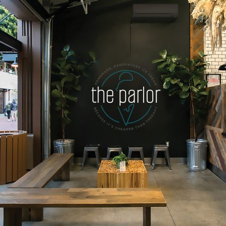
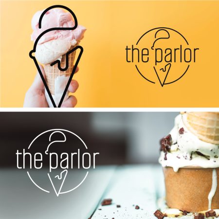
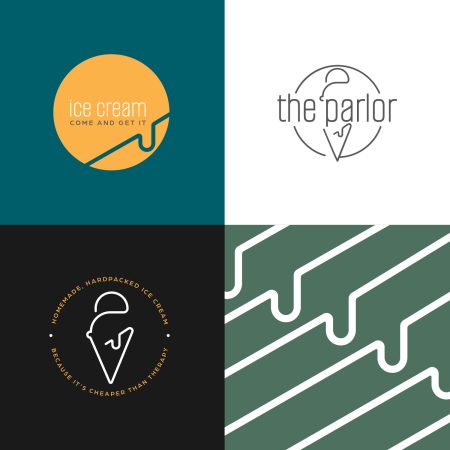
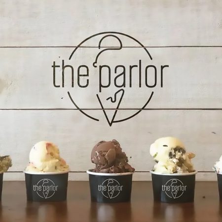
We had the pleasure of creating the logo and branding for The Parlor. Inspired by vintage ice cream parlors, we designed a look that feels nostalgic yet modern, industrial yet welcoming. The logo centers around the simple yet iconic outline of an ice cream cone, with a playful drip that adds personality without overcomplicating the design. The result is a clean and uncluttered aesthetic that invites people to enjoy a scoop while soaking in a one-of-a-kind atmosphere.
UPTOWN ANKENY
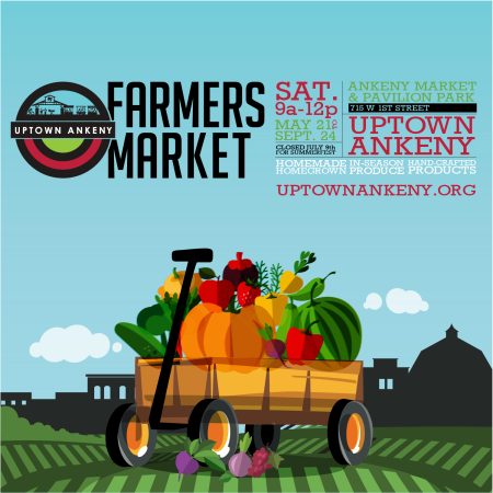
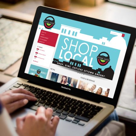
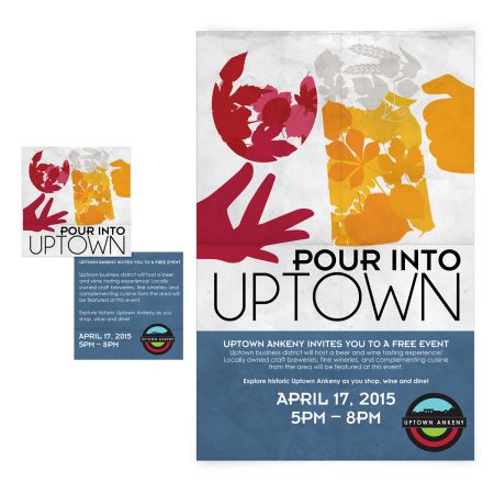
Uptown Ankeny is a charming community filled with quaint shops and a welcoming atmosphere. The project involved creating a fun, vibrant logo & brand that captures the unique character of the town. The logo highlights the iconic buildings at the heart of the community, serving as a visual anchor that celebrates Uptown Ankeny’s history and charm. The branding extends to the town’s farmers market and special events, incorporating cohesive design elements to unify all aspects of community engagement.
FIRST STEPS
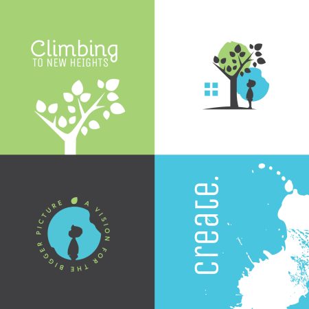
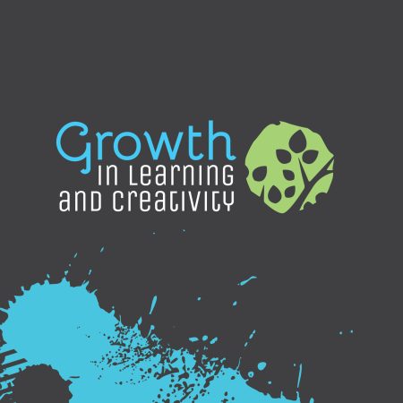
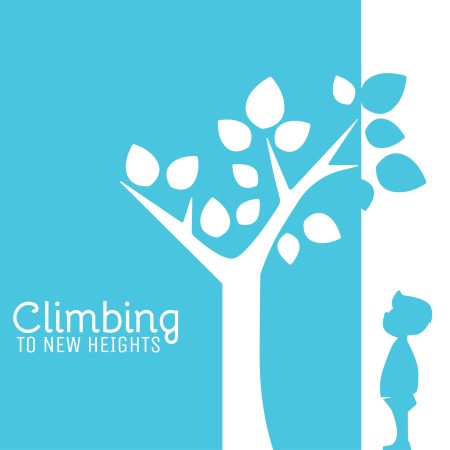
For First Step Early Learning Center, we crafted a logo and branding that embody creativity, optimism, and growth. The design captures the essence of childhood curiosity while reflecting the nurturing environment where development flourishes. The logo symbolizes growth, imagination, and development. Hidden within the tree’s negative space is the outline of the learning center building—a subtle yet powerful representation of the foundation where it all begins. Bright splashes of color, intentionally going outside the lines reminding us that creativity often thrives in the unexpected. Our goal was to create a brand that feels both whimsical and classy, with a soft, organic aesthetic that’s approachable and inviting. The clean design is balanced with playful elements, encouraging a sense of wonder and exploration.
OASIS CBD
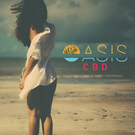
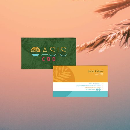
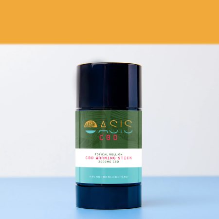
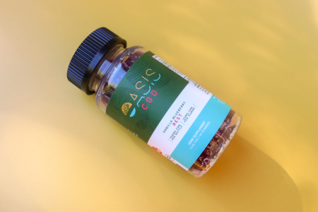
We designed a logo, branding, and product packaging that evoke the serenity and luxury of a personal tropical paradise. Drawing inspiration from palm trees, sunsets, and the tranquil allure of water, we created a visual identity that embodies peace and indulgence in a minimalist and uncluttered way. With its clean and sophisticated design, Oasis CBD’s branding feels like a small slice of paradise in the desert—a perfect reflection of the product’s promise to bring calm and luxury to daily life. Whether on a product label or promotional material, the brand invites everyone to discover their own oasis.
MAKUSAFE IDENTITY AND BRANDING
We had the privilege of designing the logo and branding for MākuSafe® at the inception of their innovative journey a few years ago. MākuSafe® develops award-winning workforce wearable technology. The branding reflects the company’s cutting-edge technology and mission to improve workplace safety, combining modern aesthetics with a focus on trust and innovation. This foundational design continues to support MākuSafe® as a leader in safety technology.
PLEASANTREATS
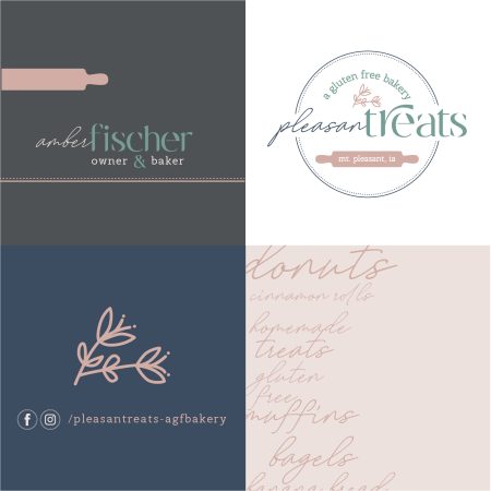
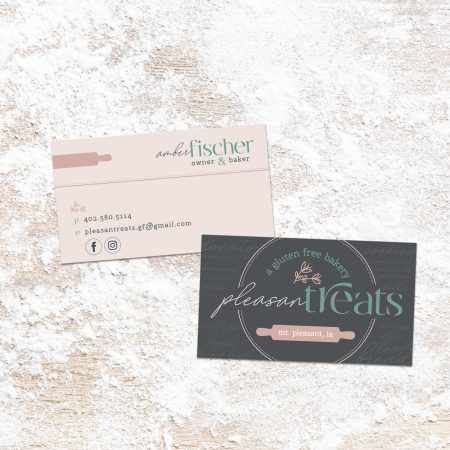
We created a logo and branding that celebrate the warmth and friendliness of small-town life. The bakery’s name, a clever nod to the word “pleasantries,” and the small town of Mt. Pleasant Iowa is both unique and inviting, so we made it the focal point of the design. The logo embraces a charming, homespun vibe with small yet meaningful details that immediately connect to the bakery’s craft of creating delicious gluten-free treats. The design conveys a sense of community and care, perfectly aligning with PleasaTreats’ mission to offer bagels, muffins, donuts, and more—all gluten-free and made with love.
ZAKAH LIFE
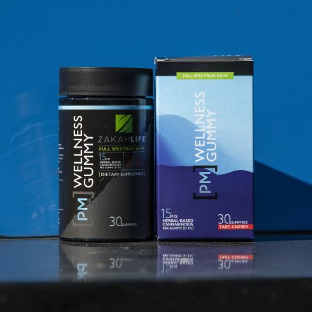
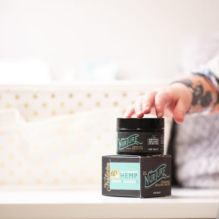
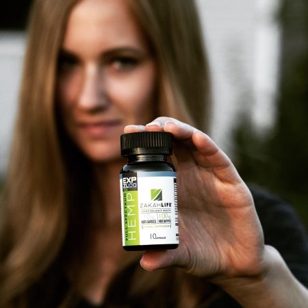
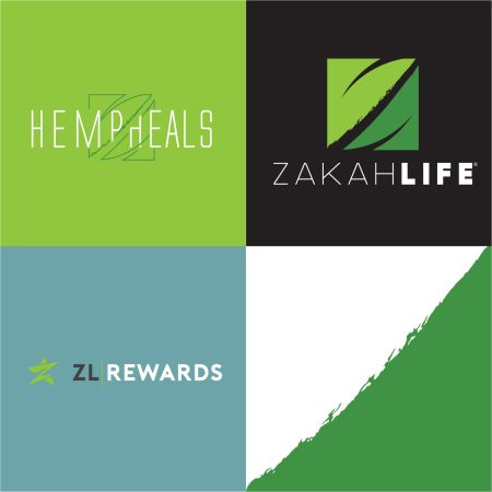
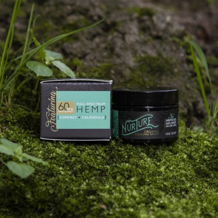
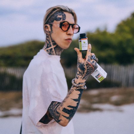
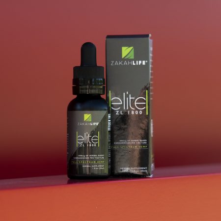
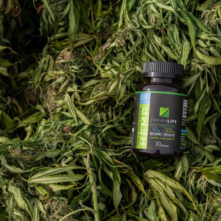
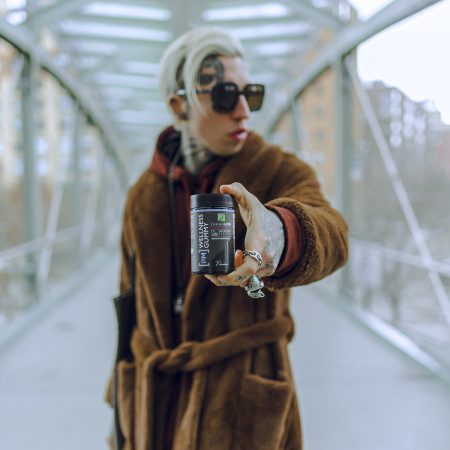
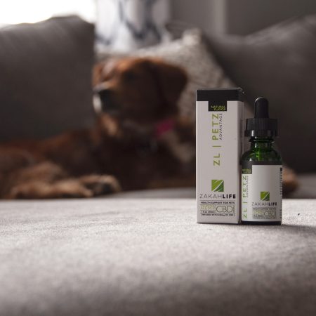
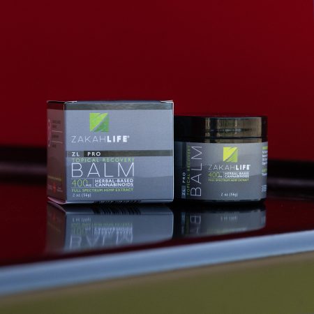
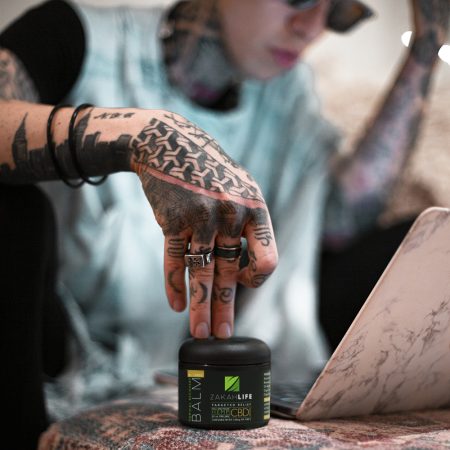
Zakah Life is a full-spectrum hemp supplement brand catering to individuals seeking organic, natural solutions to enhance health and well-being. The project involved creating modern, trendy branding and packaging designs that reflect the purity and effectiveness of the product. The designs resonate with a health-conscious audience, emphasizing the product’s organic roots and commitment to quality. Deliverables included logo design, product packaging, and marketing assets to solidify Zakah Life’s presence in the wellness market.
BLACK SILO
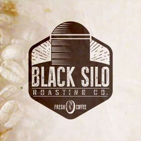
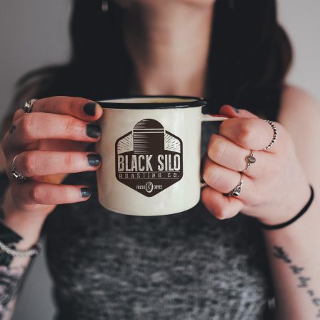
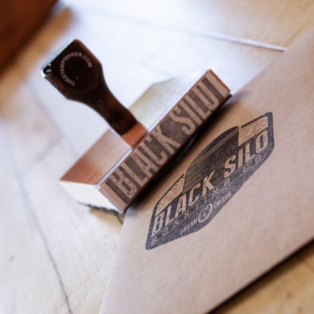
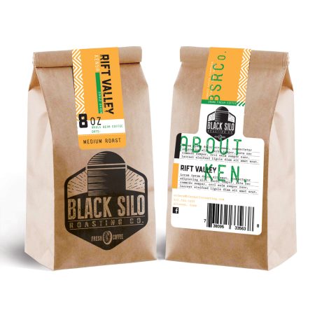
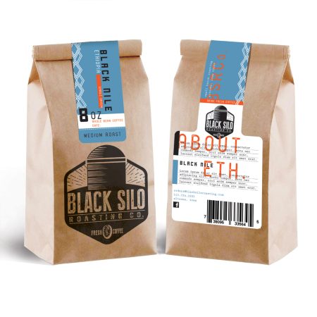
Black Silo Roasting Co. being rooted in the heartland, embraced an industrial aesthetic that honors its hardworking heritage. The project began with naming the brand, followed by designing a bold, iconic logo and cohesive branding elements. The product labels for their coffee bags featured authentic textures, industrial-inspired typography, and bright tones, creating a strong connection to the Midwest’s agricultural and industrial spirit. The final designs encapsulated the brand’s authentic, no-nonsense character while appealing to coffee enthusiasts who appreciate craftsmanship and quality.
PORCH LIGHT COFFEEHOUSE
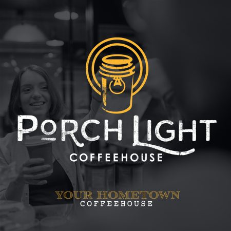
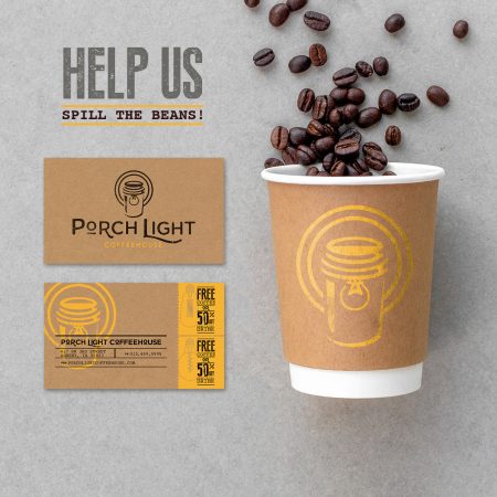
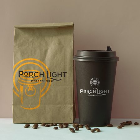
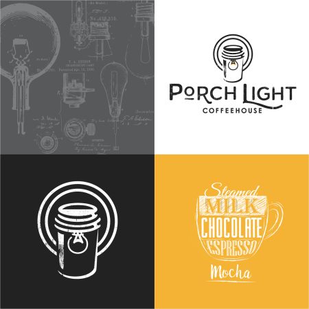
Porch Light Coffeehouse was designed to reflect the warmth and charm of a neighborhood gathering spot. The project began with naming the business, capturing the local, friendly feel that makes it a community favorite. The logo features a clever double meaning, combining the imagery of a welcoming porch light with a travel coffee cup and saucer, symbolizing comfort and connection. The brand embraces a vintage vibe, using nostalgic design elements, retro-inspired typography, and a warm color palette.
ALLER DESIGN
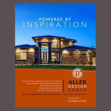
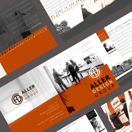
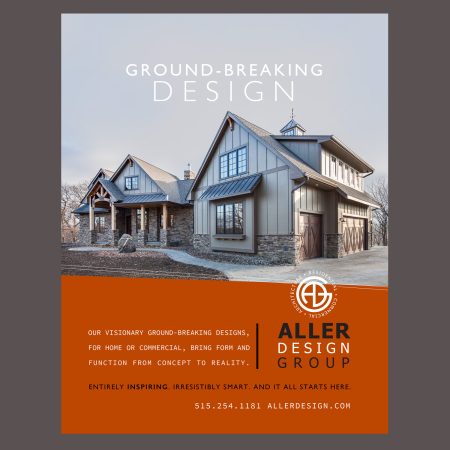
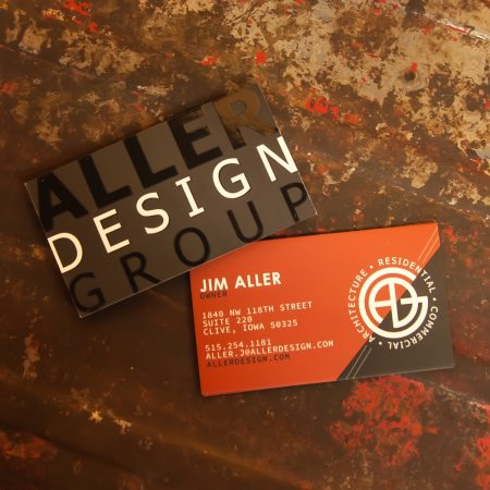
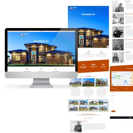
We crafted a comprehensive branding package that included logo development, collateral, website design, and magazine advertisements. Aller Design specializes in designing homes and commercial properties with an emphasis on architectural artistry and groundbreaking innovation. Every detail matters, and their work exemplifies the perfect balance of form and function. Our goal was to reflect their visionary approach through powerful, rich designs that showcase their work and elevate their brand identity. From sleek branding elements to an elegant website that highlights their portfolio, every piece we created embodies the sophistication and innovation that Aller Design brings to every project.

